


")

Fashion Design Color Palettes: Must-Have Tools When Designing A New Collection
Experimenting with fashion design color palettes might be one of the most fun aspects of designing (although some might say it’s more intimidating than fun!). I absolutely love color and the thrill of combining colors together to create a collection. Your collection’s color palette will set the mood, tell a story, and connect people emotionally to your work, before they even know why.
And while there are literally millions of color combinations you can design with, it’s helpful to understand the basics of color theory before you start sewing fabrics together. Back in 2009 when I launched my first clothing brand, I got scrappy with what I had to work with, but as I got more advanced, I realized just how much easier it was to design when I had the right color palette tools at my fingertips.
So today, I’m sharing exactly which tools I’d never want to be without as a fashion designer when designing a collection.
Key Takeaways
- Where to Start with Color Inspiration
- Seasonal Color Palettes: Spring, Summer, Fall, and Winter
- Designing with the Seasonal Color Palettes (My Pro Tips)
- Understanding RGB vs. CMYK
- Tools for Building Fashion Design Color Palettes
- Playing With Color Takes Time
- Your Next Steps
Where to Start with Color Inspiration
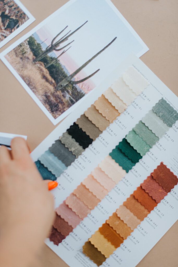
When dreaming up a fashion design color palette for a new season, I always love turning to nature. Seriously, there’s no better artist than the one who painted the skies, flowers, oceans, and everything in between. Looking at the colors found in a single flower or landscape can offer endless combinations to build from.
And once you have that base inspiration, you can start playing. Adjusting saturation, hue, and contrast can completely transform a palette from soft and romantic to bold and vibrant.
→ Read the whole post on creating nature-inspired color palettes here.
Seasonal Color Palettes: Spring, Summer, Fall, and Winter
If you’ve ever heard someone say, “I’m a Winter” or “That color looks very Spring,” they’re probably talking about seasonal color analysis. This framework is wildly useful in fashion because it categorizes color palettes based on the undertones, contrast, and clarity that naturally flatter certain skin tones or create specific moods in a collection.
Even if you’re not designing for personal wardrobes, understanding the seasonal palette types can help you build more cohesive collections.
Here’s a quick breakdown of the four main color seasons:
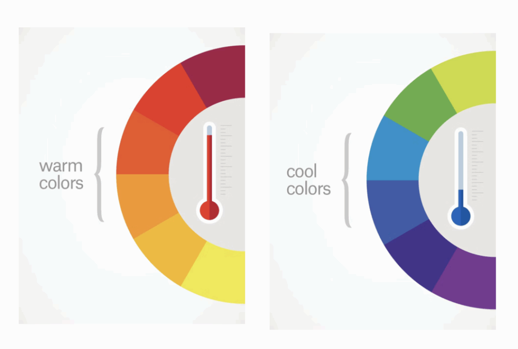
- Spring: Think warm, clear, and bright. These palettes are full of fresh, energetic colors like coral, peach, turquoise, and butter yellow. Great for a youthful, optimistic vibe. Spring colors are all from the warm side of the palette. Even if the basic color is from the cool side of the palette (like purple, blue, or green), you can pull the color to the warm direction and lighten them up to create spring colors.
- Summer: Cool, soft, and muted. Summer palettes lean into pastels, soft blues, lavenders, and rose pinks. They give off calm, romantic, and classic energy. The summer colors are on the cool side of the palette and lightened up.
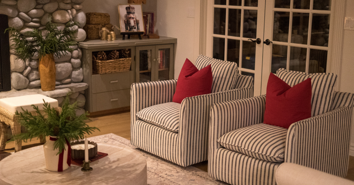
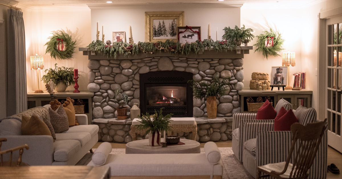
- Fall (Autumn): Warm, deep, and earthy. Fall palettes feature rich, grounded colors like rust, mustard, olive green, deep teal, and burnt orange. Perfect for cozy, sophisticated designs. They are all of the warmest and deepest colors, whereas the spring colors are warm and lighter than the fall colors.
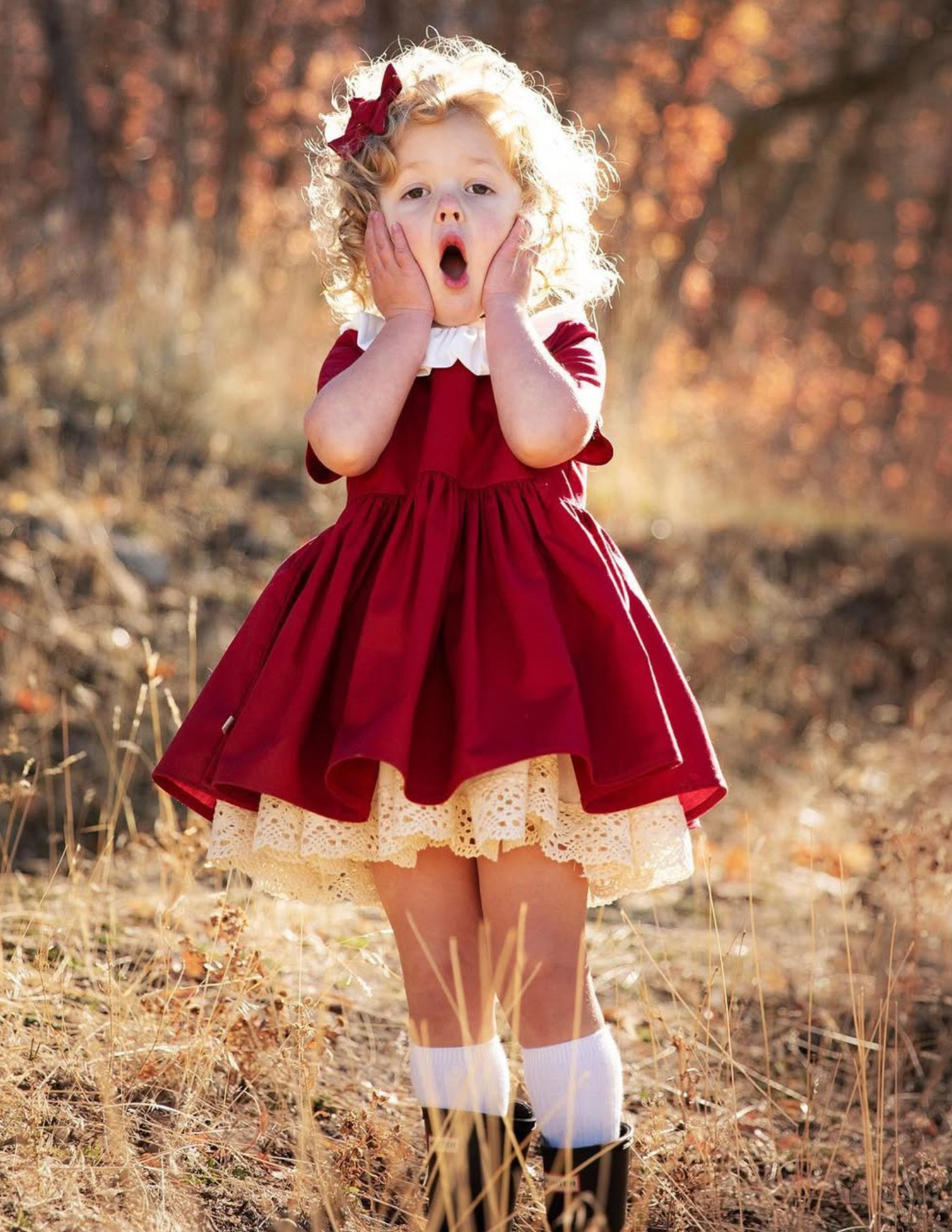
- Winter: Cool, bold, and high-contrast. Think jewel tones.These palettes are the most vibrant and striking, black and white, royal blues, intense purple, emerald, and true red. Ideal for edgy, elegant, or high-drama fashion moments. People with dark hair and depending on eye color tend to look incredible in these colors.
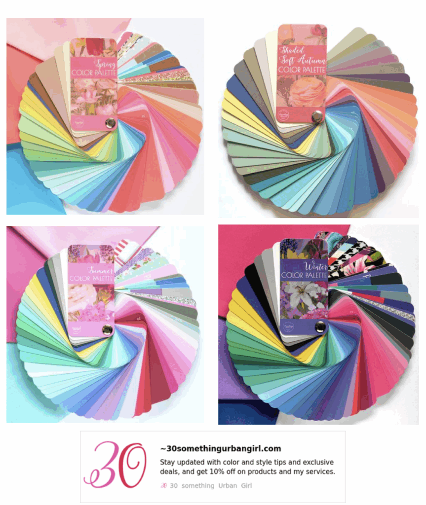
GRAB MY FREE COLOR GUIDE HERE!
The images above are taken from my FREE color guide – everything you need to know to get started when working with color. Grab it here!
Designing with the Seasonal Color Palettes (My Pro Tips)
If you’ve ever walked into a store and the colors seem to look messy or haphazard, it’s probably because the designer has tried to appeal to all four seasons at once. Unfortunately, that just creates a confusing and overwhelming feeling for the customer. If you try to make your clothes work for everyone at once, then you won’t be the perfect fit for anyone.
I personally prefer to design with cohesive color palettes that fit within one season at a time. I’ll usually design 3 or 4 collections so I can offer a variety of color palettes at once. As a smaller boutique brand, I can be more specific.
You get to decide if you want to have options for season type, or if you want to have a cohesive palette. There are ways you can be tricky with your designs to reach a larger audience.
→ Looking for high-quality fabrics at an insane price point? Check out Persnickety Fabrics to see what’s new!
Understanding RGB vs. CMYK
Before you get too deep into choosing colors, it helps to understand the basics of color systems. This is important when you’re translating your palette into physical products or digital graphics.
Here’s a simple way to think about it:
- CMYK is what you’ll use for print. Think of it like a child mixing paints. You’re layering pigment, Cyan, Magenta, Yellow, and Black, to create different hues on paper or fabric.
- RGB is for anything viewed on a screen. It works by removing light from red, green, and blue to create colors digitally. This is your go-to when designing on a computer, working with lookbooks, websites, or social media graphics.
Knowing when and how to use each color mode helps you avoid surprises, like a color looking vibrant on your screen but printing out dull.
→ Wishing you had a support system while you build your dream fashion brand? Check out my mentorship program, Fruition!
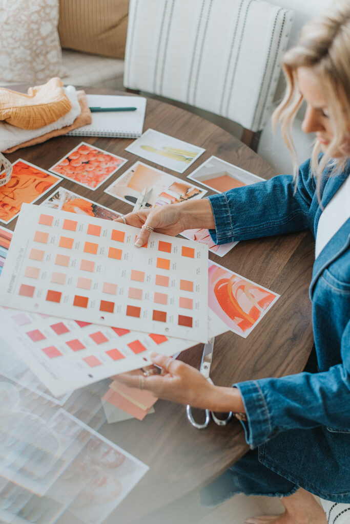
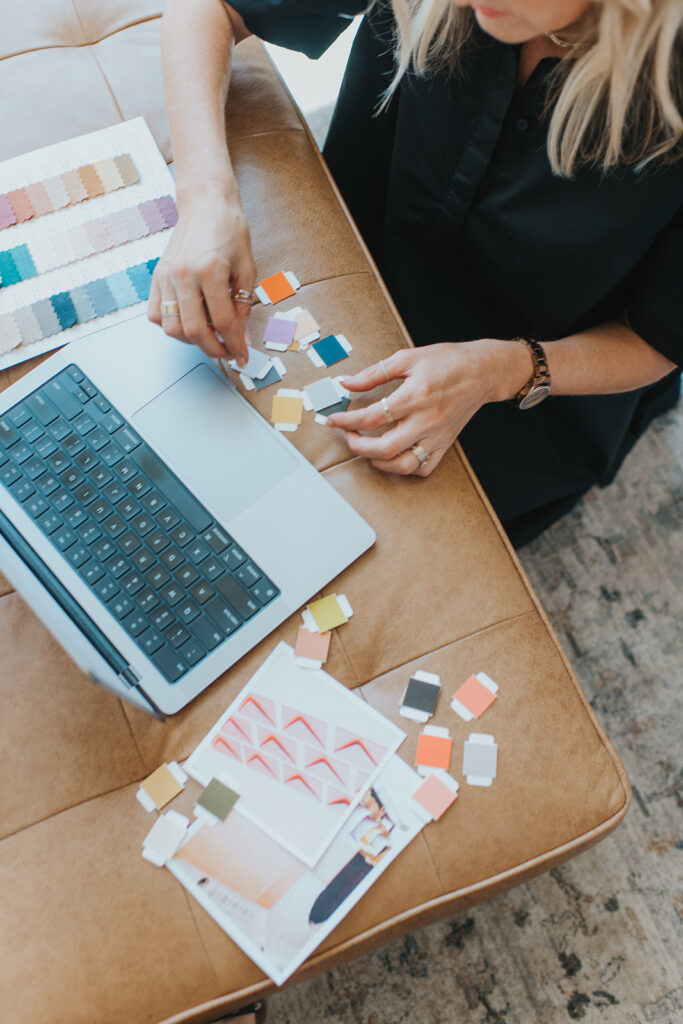
Tools for Building Fashion Design Color Palettes
Now that you’ve got some inspiration and a touch on the basics, here are a few tools that can help you create a fashion design color palette you feel confident about:
- Pantone: If you’re serious about your design work, this is an investment worth making. Pantone is the universal color language for designers across the world. Their digital swatches and physical fabric swatch books are perfect for ensuring consistency from screen to sample to production. Yes, it’s pricey, but if you’re working with manufacturers, it’s almost essential. I have yet to find a manufacturer who doesn’t use it.
- Canva: This is a great option for beginner and intermediate designers. Use the color picker tool to build your palette from images or mood boards, or pull from existing color palettes. I often use it to quickly visualize how colors look side by side before diving into production decisions. I love taking a beautiful picture from nature, creating some squares and pulling the colors from the picture to create a palette.
- Coolors.co: If you need help finding complementary colors or building a palette from scratch, this is the tool for you. Coolors generates tons of ready-made palettes that you can adjust and tweak. It’s fantastic for those days when you’re feeling creatively stuck or want to try something totally new. It can also pull the colors from an inspo picture.
Playing With Color Takes Time and That’s Okay
One thing to remember: this process takes some exploration. Sometimes a palette feels perfect until you start adding other elements, fabric, garment shape, even photography style, and suddenly, the color feels off. That’s normal! Keep playing. Shift a tone slightly, or try a new complementary shade.
Color is both an art and a science, and your instincts will get stronger the more you use them. Trust your eye, and don’t be afraid to break the rules once you understand them.
Your Next Steps
First of all, don’t forget to grab your FREE COLOR GUIDE here.
If you loved learning about color theory, seasonal palettes, and how to elevate your brand visuals, then you’re going to love Fruition. It’s my signature program designed to walk you through the entire fashion development process, from concept to production, while helping you create a product line that actually sells.
Inside Fruition, you’ll learn how to choose the right colors, fabrics, and silhouettes that speak to your audience (and not just your personal taste). Plus, we’ll make sure you avoid the costly mistakes most emerging designers make.
Join Fruition now and start building the brand you’ve been dreaming about.


Read the Comments +